
Exploring the Power of CSS3
Introduction
Cascading Style Sheets, or CSS, have been an integral part of web design since the early days of the World Wide Web. They allow developers to control the presentation and layout of web pages, ensuring that content is not only accessible but also visually appealing. CSS has come a long way since its inception, and CSS3, the latest major version as of my knowledge cutoff date in September 2021, introduced a plethora of new features and capabilities. In this article, we will delve into the details of CSS3 and explore some of its most prominent features.
1. Modular Approach:
CSS3 follows a modular approach, meaning it’s divided into various modules, each addressing specific styling aspects. This modularity allows developers to pick and choose which features to implement, making CSS3 more efficient and easier to work with.
2. Selectivity and Specificity:
CSS3 provides improved methods for selecting and styling elements on a webpage. Selectors have become more advanced, allowing for precise targeting of factors. Introducing pseudo-classes and pseudo-elements enables developers to style elements based on their states and positions.
3. Box Model Enhancements:
The box model, a fundamental concept in CSS, was enhanced in CSS3. Developers can now control box-sizing, ensuring padding and borders don’t affect an element’s dimensions. This is particularly useful for creating responsive layouts.
4. Flexible Box Layout (Flexbox):
Flexbox is a game-changer for creating complex and flexible layouts. It allows for the easy alignment and distribution of space among items within a container, making it ideal for designing responsive and dynamic web pages.
5. Grid Layout:
CSS3 introduced the Grid Layout module, which provides a two-dimensional grid system for designing complex layouts. Grids enable precise control over rows and columns, facilitating the creation of responsive designs that adapt seamlessly to various screen sizes.
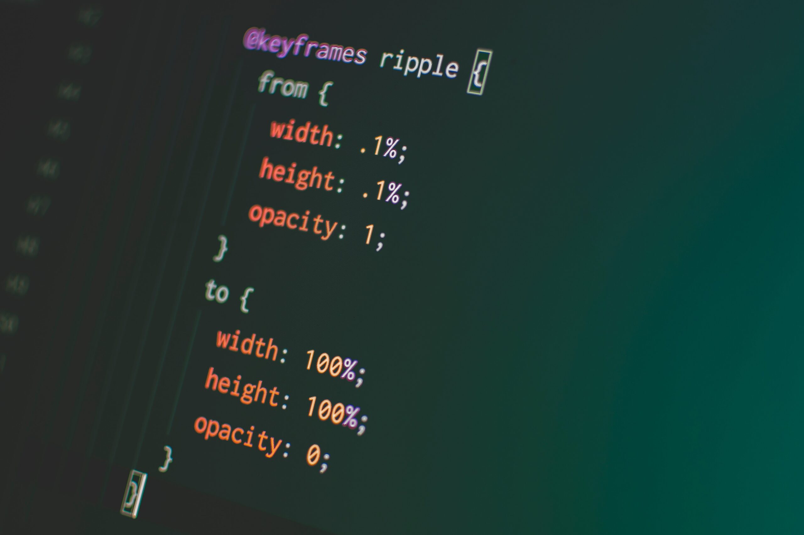
6. Animations and Transitions:
CSS3 offers powerful tools for creating animations and transitions without relying on JavaScript or external libraries. The `@keyframes` rule allows developers to define complex animations, while the `transition` property makes adding smooth transitions between CSS property changes easy.
7. Custom Properties (Variables):
CSS3 introduces custom properties, also known as CSS variables. These variables allow developers to store and reuse values throughout their stylesheets, promoting maintainability and consistency.
8. Media Queries:
Media queries have become crucial with the rise of mobile devices and varying screen sizes. CSS3 allows for media queries that enable developers to apply different styles based on screen width, device orientation, and resolution.
9. Filters and Blending Modes:
CSS3 includes filters like `blur,` `grayscale,` and `brightness,` which enable image manipulation directly through CSS. Blending modes allow for the creative blending of overlapping elements.
10. Typography Enhancements:
CSS3 introduces improved typographic control with features like `font-variant,` `text-overflow,` and `font-feature-settings,` providing fine-grained control over text styling.
11. Responsive Design:
CSS3 is pivotal in creating responsive web designs that adapt seamlessly to various screen sizes and devices. Media queries, flexible box layouts, and grid systems are crucial to responsiveness.
Conclusion
CSS3 has revolutionized web design by providing developers with various tools and techniques to create modern, responsive, visually appealing websites. Its modular structure, enhanced box model, layout options, animations, and typography controls have made web development more efficient and flexible. While CSS3 was the latest major version as of my last knowledge update in September 2021, it’s essential to note that web technologies continually evolve. Therefore, web developers should stay updated with the latest CSS developments and best practices to create cutting-edge web experiences.